Three disciplines.
One unit.
We are 3UN, a digital innovation hub working across design, engineering and data. One team takes your brand, product or system from first sketch to launch.
Identity, UX and interface. We research the audience first, then design every touchpoint to match.
Web, mobile, APIs and automation. Custom software built to integrate with what you already run.
Big data processing and analytics, delivered with our parent company MAMS and partners InterSystems.
každý test.
Augustín
AugustínWork
drinking?
Every day. Our largest projects don't have a logo to show. They move and process healthcare and farm data for InterSystems, hospitals and mooml. Read about our data work →
Since 2017 we've built for companies in healthcare, industry and finance. Designers, engineers and data people sit on the same team, so nothing gets lost between agencies.
PSR Rally Team
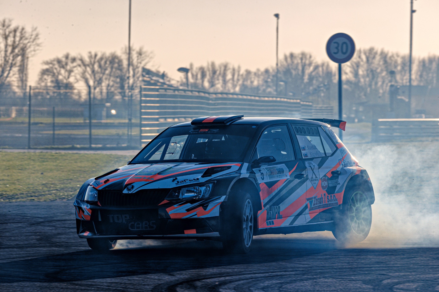
A website for a Slovak rally team, built around the photos their fans come for and the race calendar their partners need.
každý test.
We kept what fans already knew from the old site, the letter-spaced navigation, the numbered slides and the ▽ marker, and rebuilt everything around it. The type is a wide, slanted grotesk. Shapes take their angles from the car's livery: corners are cut at 45°, stripes run at 60°. The photography always runs full-bleed.
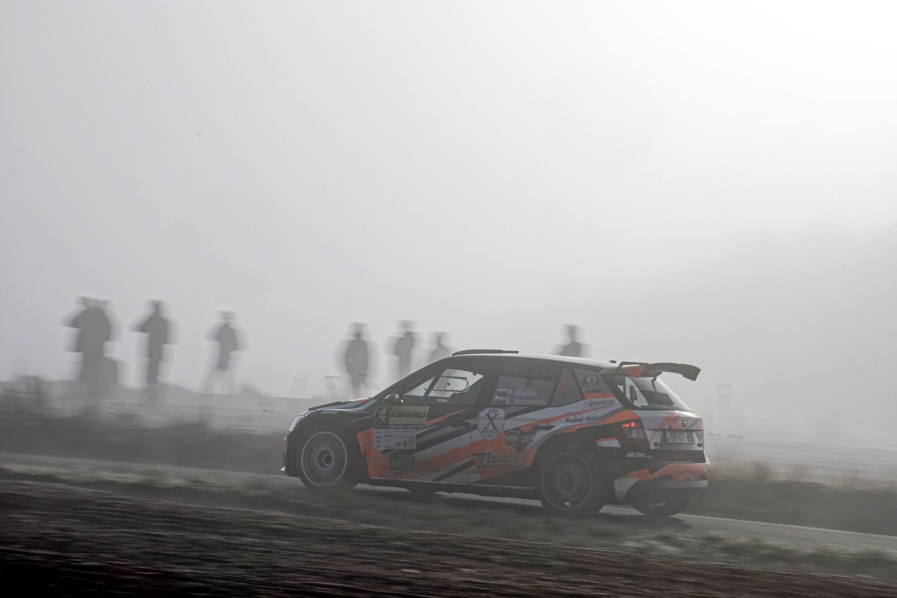 TARMAC MASTERS · IMG_7148
2026
FABIA R5
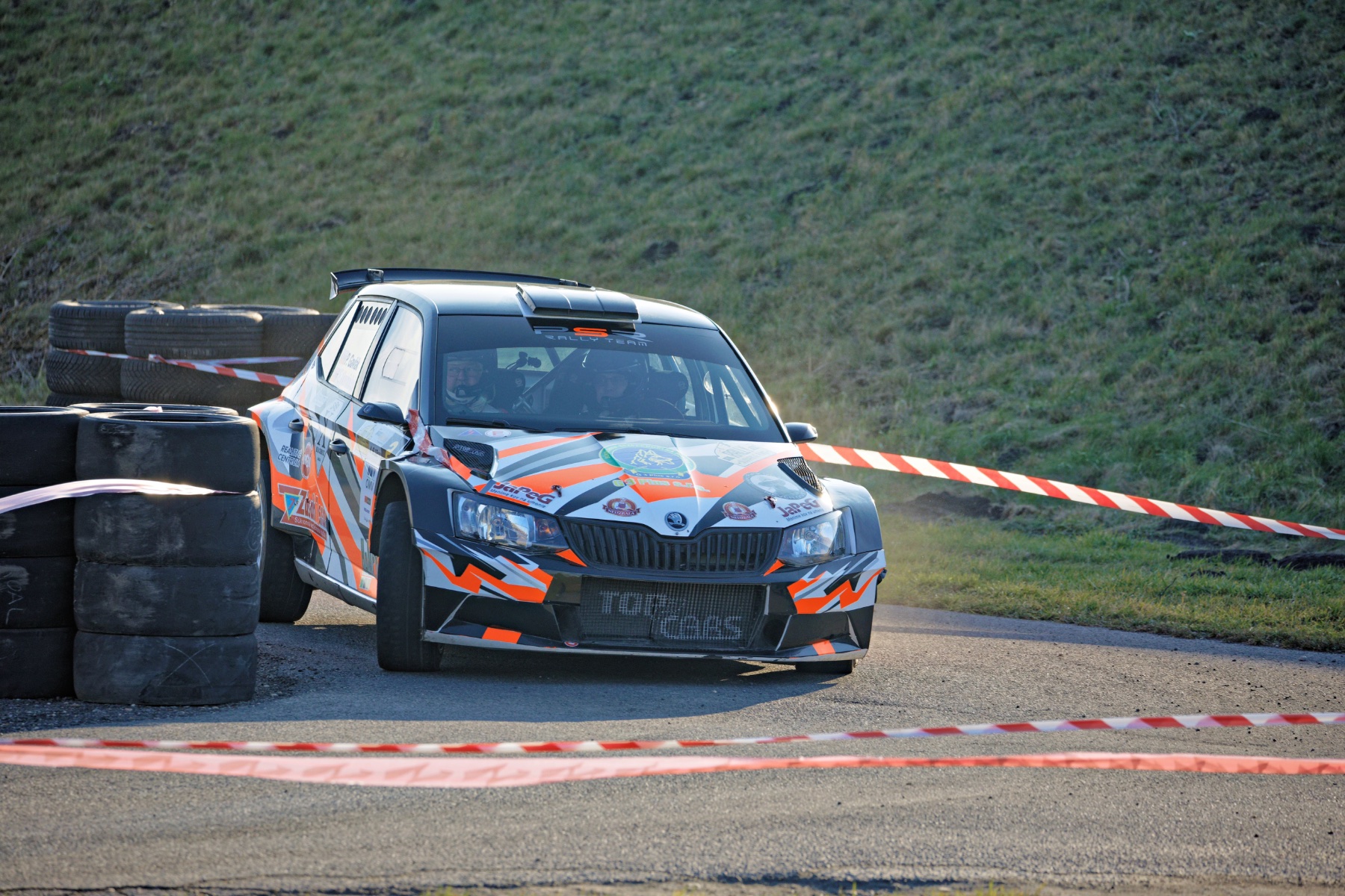 ASF_0958
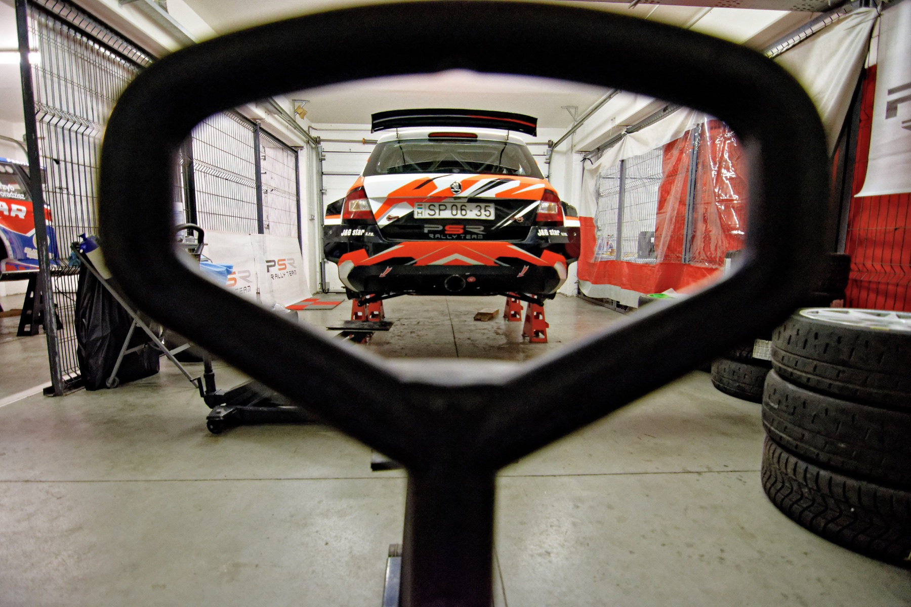
08 MIN ČÍTANIA
FOTO: DSC_0581
DO SERVISUArticle page. Long reads and race reports get an editorial layout: one large photo, a narrow text column and captions with the photographer's frame number.
 ASF_7814 · Slovakia RingIMG_7148DSC_0581ASF_0958
každý test.
Martin Augustín
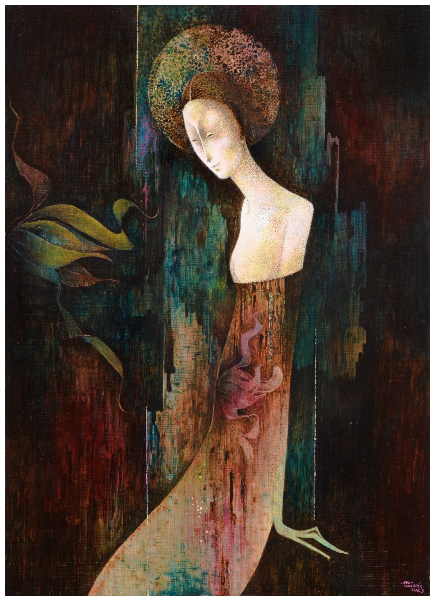
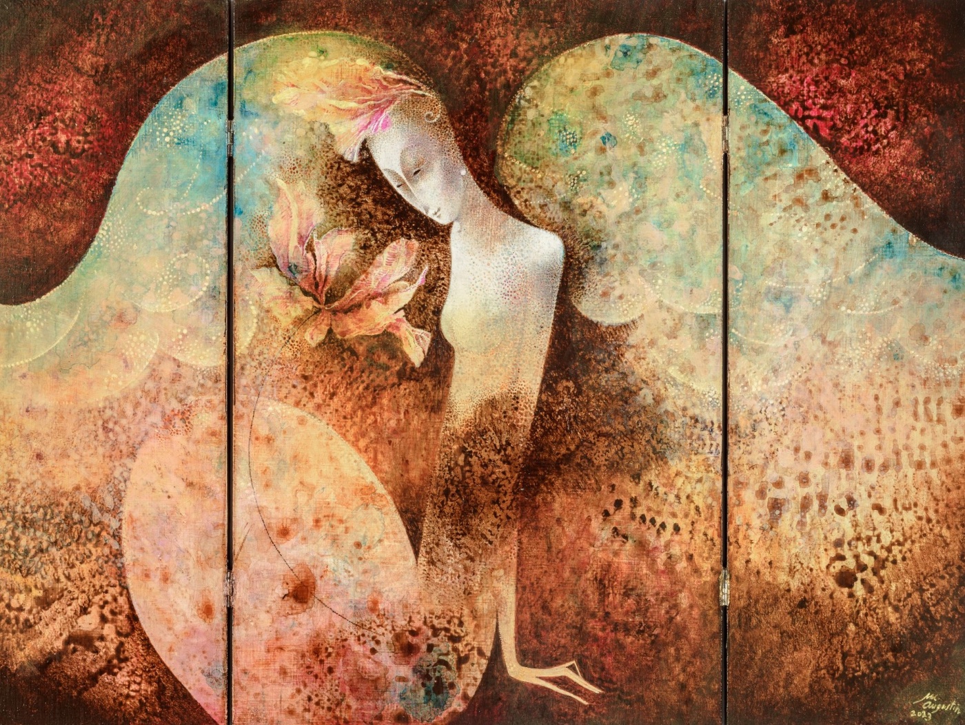
An online gallery for a Slovak painter. The site steps back so the gold leaf, collage and texture of each piece can carry the page.
Augustín
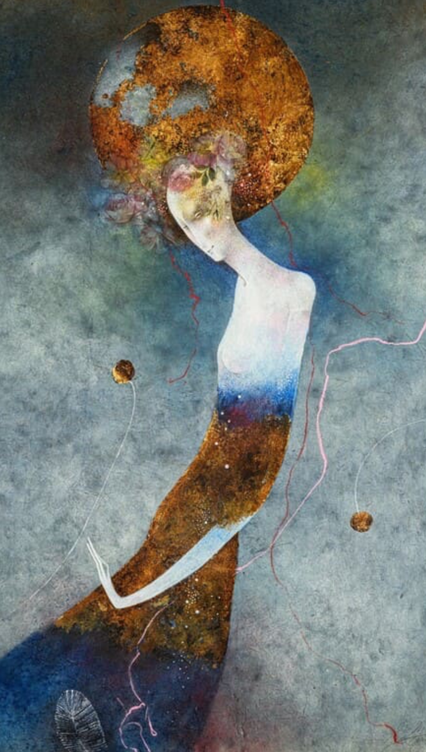
One work per screen, warm paper tones that sit next to the pigments, and a light serif for titles. Captions stay in Slovak, as the artist writes them. Each piece has its own page with technique, year and a direct enquiry.
AugustínMenu
Modrá madona, 2022Title, 2023Title, 2023 · triptych Title, 2023
 Title, 2023
 Jen I., 2022
 Title, 2023 · 140/184
EnerWyze
Brand identity for an energy-tech startup that uses AI to cut energy waste in real time. The whole system grows from one idea: the letters E and W, reduced to three horizontal and three vertical bars.
The symbol is the brand's initials, E and W, simplified until only their strokes remain. The E keeps its three horizontal arms, the W its three vertical strokes. Set side by side, the bars read as a meter, a battery and a bar chart at once, which suits a company that turns energy data into savings.
Everything else in the identity is built from these six bars and their exact proportions: the pattern, the charts, the layouts. Corners stay square throughout.
accounted
for.Real-time AI that finds
and removes energy waste.
podpit.sk
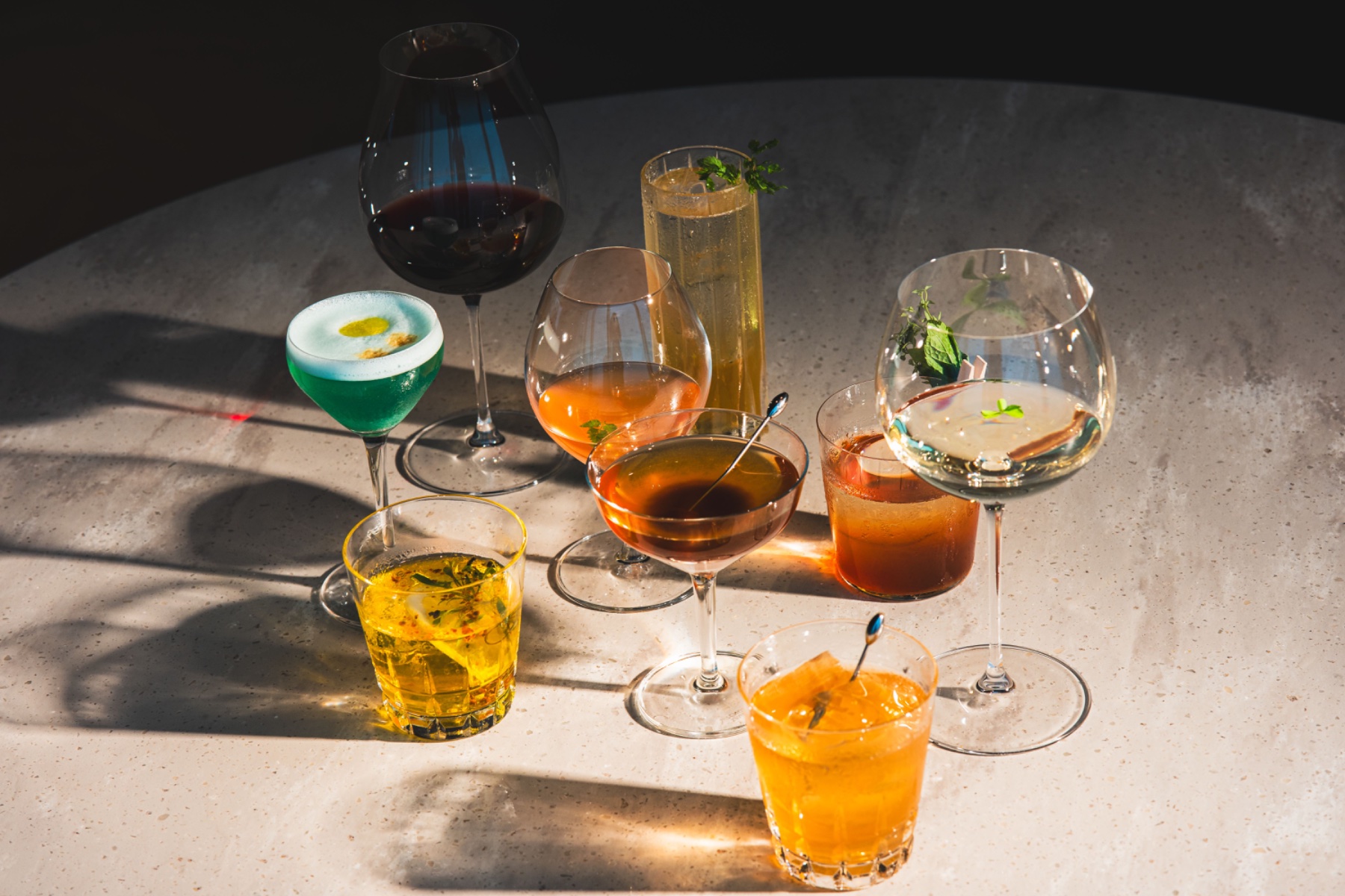
Drinks and grocery delivery for lockdown Bratislava. We built the identity and a working beta of the ordering platform in a matter of weeks.
in 30 min
The name plays on the Slovak "poď piť", come have a drink. We gave it a loud, friendly wordmark, a fizzy lime and bottle-green palette, and an app where the basket is never more than one tap away. The platform reached beta; the service never launched.
drinking?
Data at scale
Our largest projects have no logo to show. They collect, clean and connect millions of healthcare and farm records every day, for InterSystems, hospitals and mooml.
Every day. 1 dot ≈ 1 source
live, 24/7
Data arrives from hospital systems, lab devices and farm sensors in dozens of formats. We bring it into one model, keep it secure, and turn it into numbers people act on.
Start a project. Tell us what you're building. One team will take it from there.
Three disciplines.
One unit.
We are 3UN, a digital innovation hub working across design, engineering and data. One team takes your brand, product or system from first sketch to launch.
Identity, UX and interface, grounded in audience research.
Web, mobile, APIs and automation that integrate with what you run.
Big data and analytics with MAMS and InterSystems.
Augustín
Every day.Healthcare and farm data for InterSystems, hospitals and mooml.Read about our data work →
Since 2017 we've built for companies in healthcare, industry and finance. Designers, engineers and data people sit on the same team, so nothing gets lost between agencies.
{{ mc.title }}
{{ mc.intro }}
{{ mc.approach }}
in 30 min
The name plays on the Slovak "poď piť", come have a drink. We gave it a loud, friendly wordmark, a fizzy lime and bottle-green palette, and an app where the basket is never more than one tap away. The platform reached beta; the service never launched.
drinking?
Every day. 1 dot ≈ 1 source
live, 24/7
AugustínMenu
Title, 2023Modrá madona, 2022Title, 2023Title, 2023Title, 2023Jen I., 2022Title, 2023Title, 2023 · triptychkaždý test.
FABIA R5
DO SERVISURace reports and long reads get an editorial layout: one large photo, a narrow text column and credited frames.